

Airofit Pro Packaging Design
Back in 2019, Airofit’s packaging concept was an acrylic box. As there were concerns about the production capabilities and the durability of this concept.
I was tasked to come up with something a bit more conventional as a plan B in case those concerns became a reality.
Inspiration
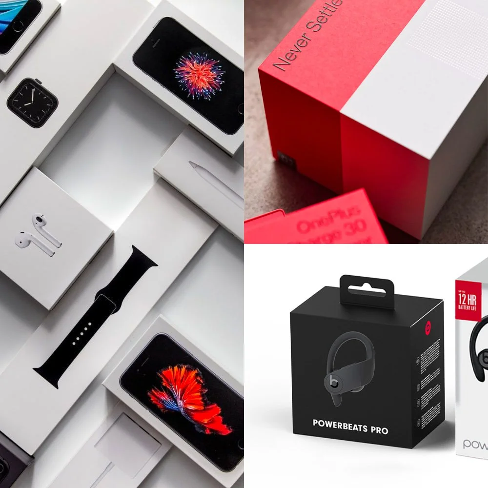
As with most tech companies, our biggest inspiration for packaging was Apple. The sharp edges, the lid that slowly slides off the box when you open it…
We also looked at examples from OnePlus and Powerbeats Pro as they use a similar colour scheme to Airofit.

Execution
For everyone to have a better impression of how the packaging would look before receiving samples, I wanted to create some mockups in Blender 3D and then render more realistic images.
The box
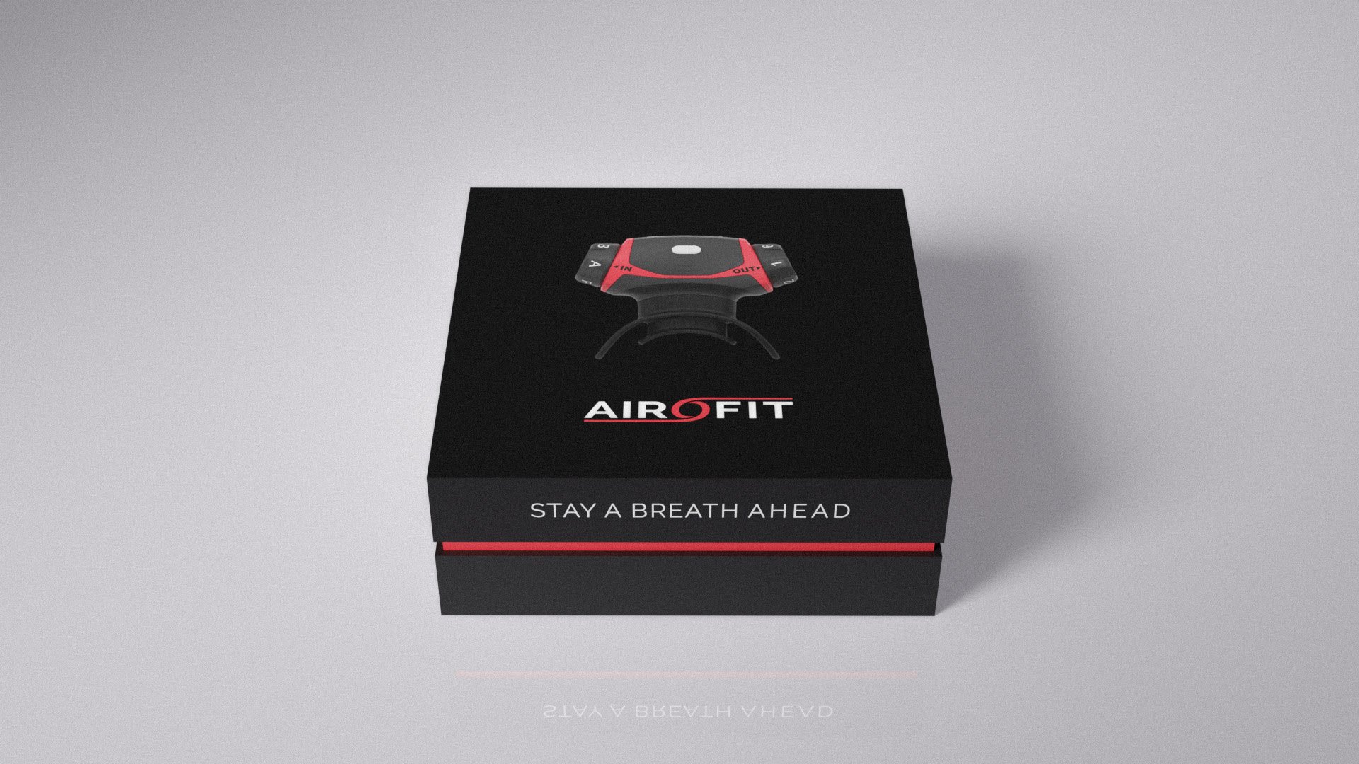
I went for a simple-to-produce 3-piece box that consists of a base, an insert and a lid. To copy the look of the device itself, I left the base and lid black, while adding a 5mm gap between the two to expose the red insert.

Product info
We wanted to add some unique selling points on the box as well - it weighs only 40g, the battery lasts for 10 hours, and the product comes with 2 mouthpieces.

Target audience
I also added icons to represent our biggest user groups, but together represent the fact that the product is meant for athletic purposes.

The back
The back of the box tells a bit more about Airofit and its values, as well as some additional product information.
It was also important to indicate that we are based in Denmark as it carries certain credibility in the consumer mindset.
And we left some blank space for retail labelling like barcodes, etc.

Print-ready
After finding a fitting producer, from there the only task was defining a print-ready die-cut in CMYK colour space and starting the production!