

Stay a breath ahead.
When I joined the team in 2019, Airofit was a plastic gadget and a huge vision of bringing better breathing to the world.
To achieve that, we needed to define our target audience and create the whole communication platform from scratch.
By the end of 2020, we were named a Top3 fastest-growing startup in Denmark.
What is it?
Airofit is an app-enabled breathing muscle training device. By implementing 5 to 10-minute breathing exercises into your routine, you can improve your general wellness, physical performance and health.
Whether you want to simply feel better on a daily basis, become a stronger athlete, sleep better or manage your asthma; as long as you want to be the best possible version of yourself, Airofit is for you.
Who is it really for?
Everyone breathes, but if we target everyone, we cannot utilize our limited resources efficiently.
“If you try to be everything for everyone, you become nothing for no one.”
I wanted an audience that would give us a shot at convincing the first movers and early adopters, and prepare us for the mass market.


People who are tech-savvy
People who measure performance

People who know consistency


The Airofit Red
We wanted something that resonates with the data-driven, tech-savvy, usually masculine audience.
We needed something bold and contrasty that stood out from the more subtle feminine colours usually associated with the yoga and wellness industry.


#EF3340

#F8F8F8
#444444
Typography
Like our accent colours, our headlines had to be strong, bold and carry confidence. Montserrat Black was a great fit for what we were looking for.
For paragraphs, we wanted something neat and tidy to express competence and credibility: Open Sans
Lorem Ipsum
Lorem ipsum dolor sit amet, consectetur adipiscing elit. Maecenas sed diam eget risus varius blandit sit amet non magna. Morbi leo risus, porta ac consectetur ac, vestibulum at eros. Sed posuere consectetur est at lobortis.
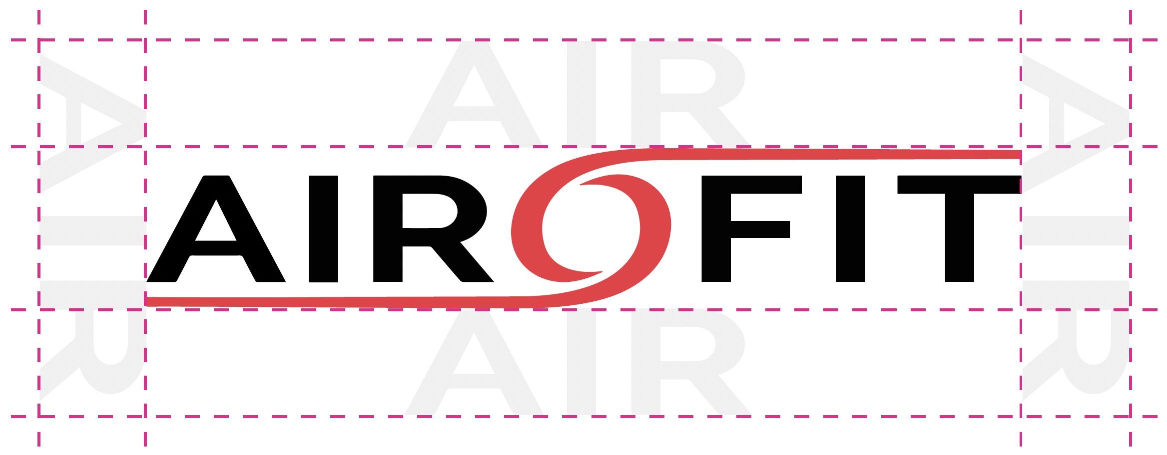
Logo and Icon
While the logo was somewhat pre-defined when I joined the team, I made some subtle changes to fix the spacing and resolution, as all we had was a small JPG file.
In order to accentuate Airofit’s digital presence and the mobile app part of the product, I added a brand icon to our communication platform.

Photography
To embrace the novelty factor of product design, as well as its somewhat complex nature, all product photography had to portray Airofit in a real use case scenario.


Website - Home page


Website - Product page

Other materials


